A True (Living) Style Guide in Practice
A few days ago Exact hosted a UX meetup in their headquarter at Delft (The Netherlands). Since I was researching new methods and technologies in order to create a new (Living) Style Guide for Exact, UX’er Koert-Jan Kooijman asked me if I would like to present our current progress and, of course, I’d agreed.
After my presentation about a ‘Living Style Guide in practice’ a few attendees asked if I would like to share my slides with them so, they could share it with their colleagues and friends as well. The slides on its own don’t say much about the topics I discussed, hence this blog post to recap my presentation.
Before I started, Koert-Jan explained why we need a (Living) Style Guide and the methods we’re using to create a modular design system. If you want to know more about modular design systems I’d like to refer you to Brad Frost’s Atomic Design principles. Understanding the basics of Atomic Design is key to understand how we’d develop our own Living Style Guide.
As a developer, I do not chase designs
Think about this: (as a developer) How often have you referred back to a style guide or final design after you have released the very first version of your product? Chances are high you did not refer back at all. Imagine that your current style guide has been updated after you have released the product. It’s unlikely that you as a developer are aware of those changes, let alone that you are checking back and forth between the product and style guide regularly. It’s simple, we don’t chase designs. To us: Design is just a concept.

Most UX’ers will disagree with this. That’s fine. I get it. UX’ers spent a lot of time in crafting the best possible experience for their customers / user base, and they think differently about colors, sizes, placement of UI elements and so on. For developers, the color ‘blue’ is just blue. For a UX designer blue can be blue in 5 or more shades, and then they still have 5 shades of light blue and dark blue. And when unlucky.. they will have a darker blue as well.
So it’s clear, we have a different understanding of design, colors, ux and whatsoever.
Closing the gap. Let’s be friends. Again
We need a style guide to solve those inconsistencies in our user/customer journey. We need the style guide so we have a clear overview of the building blocks we have. A style guide makes it easier to create a common language. Sure these are problems. But are these things the real problem? I don’t think so. We might solve problems for our customers, but let’s face it. If our collaboration is not aligned, how could we ever maintain a consistent user experience?
For example, let’s take a look at the ongoing discussion on certain UI frameworks. Developers might like to work with Angular, React, Backbone, Jade, etc.. while UX’ers really want to adapt certain frameworks like Foundation or Material Design because of the great user experience and interaction. See what happens here? When designers are making a decision, they often are making a technology decision for developers as well. In the end, we solved the issues for the customers, but in the long run, we’re getting stuck with the attached technology. I think the following picture says it all.

See how they want to make sure that no cars are able to park close to the building? To solve the problem they placed the iron pillars around the corner. Great! Problem solved. But now they want to go home.. ;-) The thing I want to make clear is that problems can only be solved when doing it efficiently. Or as Albert Einstein once said;
We cannot solve our problems by using the same kind of thinking we used when we created them ~ Albert Einstein
That brings me to the next topic.
Think different
When we created a style guide for the first time, it all started with styling. How things should look like. How it interact, how does it scale, etc.. All our previous version of a style guide started with the same approach and died silently. We must have done something wrong over and over again. Indeed! We used the same kind of thinking when creating it. This time we started with the most complex thing. The technology.
How we solved it
When developing the new style guide we asked ourselves what we really needed to solve. What is wrong with our style guide? We came up with two main issues: inconsistency and it’s hard to adopt in our new projects because of certain technology.
- Don’t bother developers with design changes. We all know what happens. They treat it as a concept and will create another version of your great design. Another version means inconsistency.
- Stick to the single source of truth We hosted all our styling definitions on our centralized Github repository. There’s only one single source of truth.
- Let UX’ers maintain the style guide When UX’ers maintain the style guide they will have a clear overview of all the building blocks, that will make their job easier as well. Sometimes UX’ers assume that their designs are already part of a certain style guide, while it’s often not and developers will re-invent the wheel, ending up with multiple solutions. Not a real single truth in this case.
- Let developers choose their own tools It’s great to have a style guide but, if it only works with Angular, Vue.js or any other library then it will become a pain in the ass. I mean who’s still using BackboneJS? When UX’ers are going to maintain it, separate technology and design
Tearing Design and Technology apart
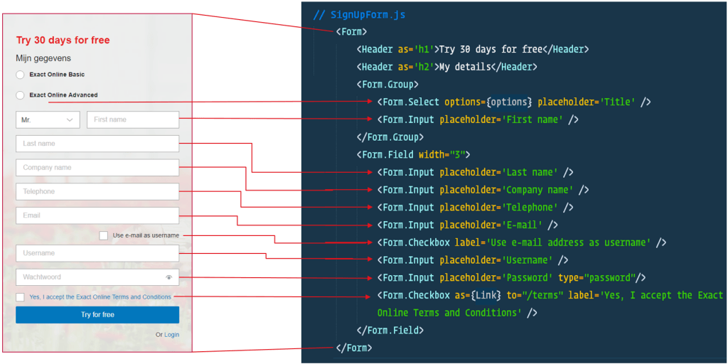
The one and only requirement is that no matter which technology you use. As long it renders the same class names into the DOM. Let’s take a look at an example.

As you can see, the code on the right does not say anything about styling. It’s almost plain English! I bet everyone can read this. Feels like a common language between designers and developers! ;-)
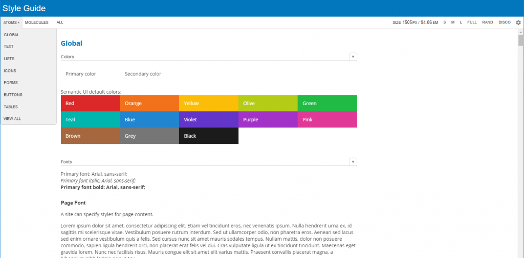
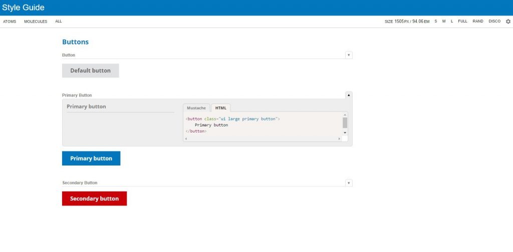
We use Semantic-UI for our style guide. One of the reasons is having a common language for designers and developers. If we need a primary button, we can just add the class primary button that’s it! The code does not say how it should look like. Note: our secondary button is not red. But I guess this happens when a developer messes around with styling…
A real Living Style Guide
So everything is in place. We separated technology from styling and we have a common language. How do we collaborate and make sure all our products are using the same single source of truth?
It’s actually quite simple. What we have done is nothing new. To be honest the technique we’re using is out there for 19 years already! It’s simply Cascading Style Sheets. Take a look at our workflow:
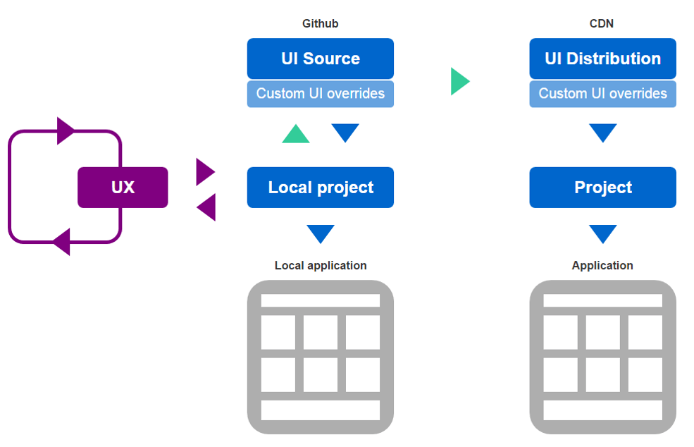
Our UX designers are constantly improving our user experience. They report back in our Github repository where we maintain the single source of truth. It’s a centralized page where we not only store the code and styling definitions but the discussions and decisions as well. After new styling definitions are added or modified we push all the changes to a CDN. The CDN distribute the styling across all our applications. That means when we update the Living Style Guide, our applications will be automatically updated as well since they are using the single source of truth.
Implementing the LSG is easy as it gets:
1code snippet to show inlcuding CNS assets
As you can see we’re using the Living Style Guide CDN url as our base. On top of it, you can still use custom CSS or theming. The reason we have done this is simply to have an isolated method to test and experiment with new styling without screwing up the single source of truth which is being used by all our applications.
Our LSG in action
Let’s take a look at our signup form, it’s the same code as I showed you earlier. But now I haven’t applied the LSG.

Looks great right! Just some minimal browser styling, out of the box for free! Let’s apply the LSG and see how easy it is to define theme’s for the atoms.
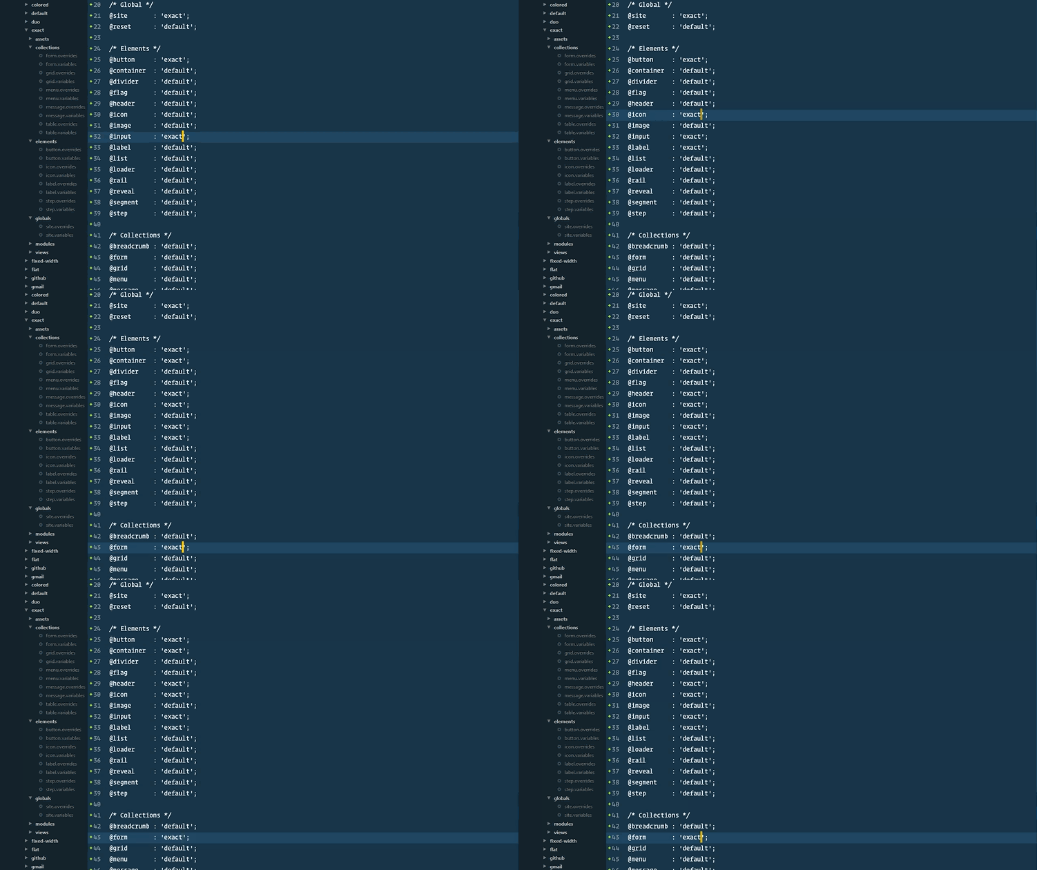
In the example above I change the theme from default semantic-ui styling to our own Exact styling. Semantic-UI makes it possible to use multiple themes within one style guide. Really easy to re-use or modify styling for specific atoms. Let’s see how our signup form looks like with this minor code change.

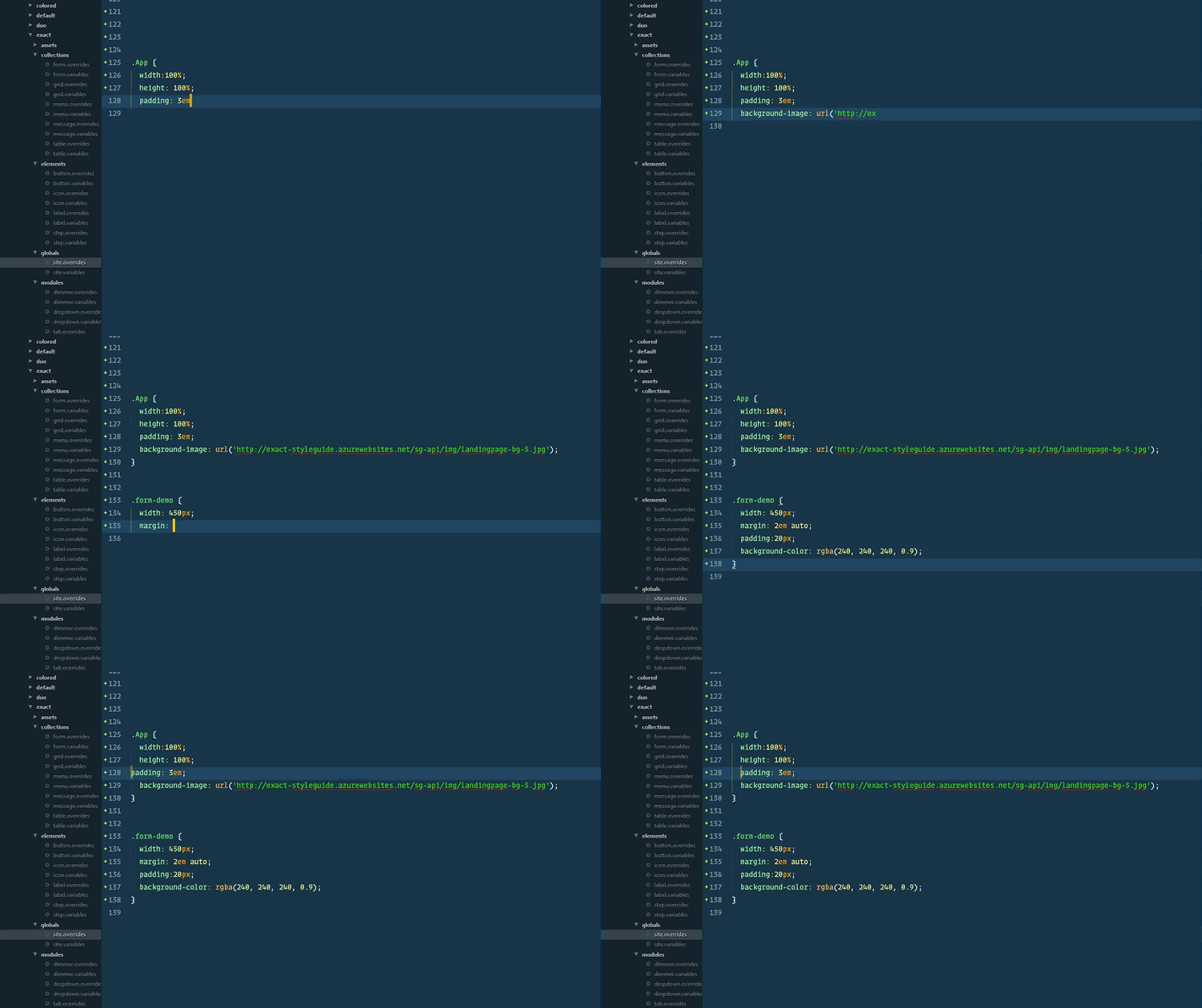
That looks even better! How about custom CSS and new things we’d like to experiment with? That’s easy as well, thanks to Semantic-UI! In the next example, I’m going to add the background image with custom CSS and apply some padding.
Let’s not take a look at the result after each change. If you can recall the signup from, then you’ll have seen it needs red heading text, not black. Let’s fix this by adding a variable @color: @red (remember we don’t care about the color code?).
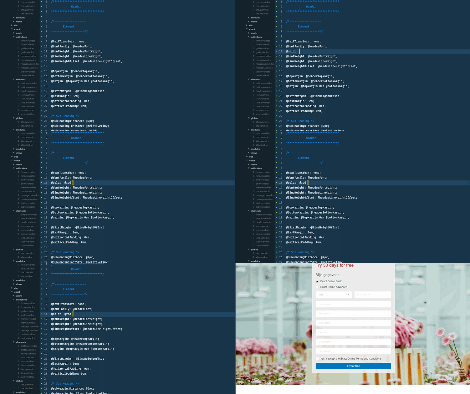
As you can see we added the background image and changed the heading from black to red.
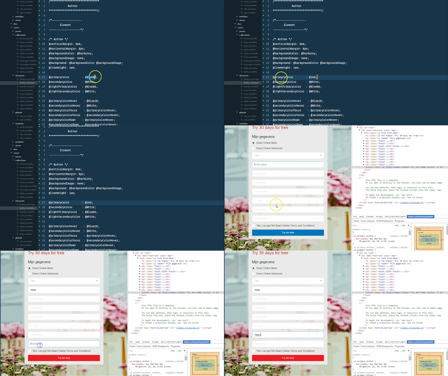
Of course, we can still change the color code. Our primary color is blue. But let’s change this to red and see how our change instantly updates our form without reloading it.
Conclusion
Creating the living style guide is not only about solving problems in the UI and user journey. It’s a unified journey for all of us. Customers, colleagues, and any other consumers. We do not only bring our products together but our colleagues as well.
Of course, we’re not there yet. We still have a ton of challenges left. Think about the behavior, interaction and if we take it a step further, hedonic qualities. All these concepts should be part of a living style guide and I’d like to update you about our journey frequently.
Thanks for reading!